The release of iOS 7 has introduced a number of beautiful new UI elements, such as borderless controls, key colors and more. This has created new opportunities for giving your existing apps a makeover or to create new ones harnessing the new features. If you want to take advantage of what iOS 7 has to offer, here are the seven biggest changes to be aware of:
1. Translucent UI Elements
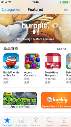
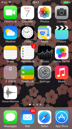
iOS 7 uses many translucent UI elements. This includes translucent backdrops, borderless buttons and key colored control icons. Status bars are also transparent to reveal the content behind. Switches are longer and thinner, while tab bars have a lighter background color.
2. Support for dynamic fonts
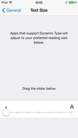
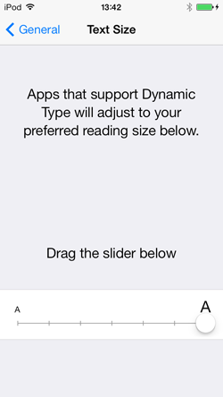
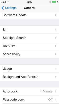
Dynamic fonts are now supported in iOS 7. Unlike in previous versions of Apple’s iOS, users can now specify the font size. This means that labels and other text holders need to support various font sizes and typefaces selected by users. in other words, layouts need to be dynamic. Instead of being hardcoded, apps will need to be able to change in size according to user specification. Navigation bars, for example, may become larger or smaller to suit different font sizes.
3. Key Colors for Controls
Control icons are now indicated by a set of key colors. This means that they are now borderless, with a blanket color behind texts. Consequently, text colors similar to the key colors should be avoided to prevent confusion. Generally layouts need to be simplified and elements presented in the neatest manner possible.
4. Control Center
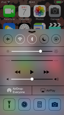
‘Control Center’ is a new feature in iOS 7. Revealed by swiping upwards from the bottom of the screen, the Control Center may conflict with what’s displayed when scrolling to the bottom. To avoid this, delicate user options should not be positioned near the bottom line.
The iOS will decide whether the gesture should reveal the control center. If the center is to be revealed, the gesture will not be sent to the currently running app. If not, the gesture will be sent to the app with a slight delay.
5. The Flick Gesture
iOS 7 introduces a new gesture called flick. To flick is to swipe or pan quickly between screens. In switcher, instead of of hold tapping and then tapping the ”x”, flicking the thumbnail upwards quits the app.
6. To support both iOS 6 and iOS 7
Two asset catalogs will be needed for apps that need to support both versions. The layout in iOS 6 and iOS 7 will be different since there are changes in metrics and in styles of UIKit controls and views. Bars, bar controls, content views and temporary views have a different appearance in different iOS versions so two asset catalogs are needed. Custom assets, such as custom buttons, background images or other controls, will be stored in these catalogs and loaded conditionally in runtime.
7. Misc items
Besides the key points outlined above, there are three rules that must be followed in iOS 7:
- App icons are 120×120 pixels
- Launch images should include the status bar area
- Retina and iPhone 5 screen size should be supported
The whole iOS 7 experience is build around the idea of clarity, deference and depth. It gives apps a refreshing impression and has been hotly anticipated. To take full advantage of the excellent new UI elements, it’s a good idea to keep all the key changes in mind when updating your apps for iOS 7.
